Dasera: Enhancing user experience & visual design of the product.
Dasera is a silicon valley based SAAS product that helps businesses ensure data security compliance and quality of data. I redesigned the product functional and visual experience to address the needs of dasera's customer base.
CHALLENGE
Following the initial product launch, customers provided valuable insights to Dasera's team regarding challenges faced while using the product. Although these issues were initially approached as bug fixes or enhancements, it soon became apparent that a comprehensive revamp was required.
Our team was appointed to address these challenges and undertake the task of improving the overall product experience.
ROLE
Product Designer
User research, Design Auditor, Ideation, Visual Design, Prototyping
TEAM
Shravani Joshi, Rahul Patil, Ashlesha Hadkar
TIMELINE
Oct 2022 - Feb 2023
Background
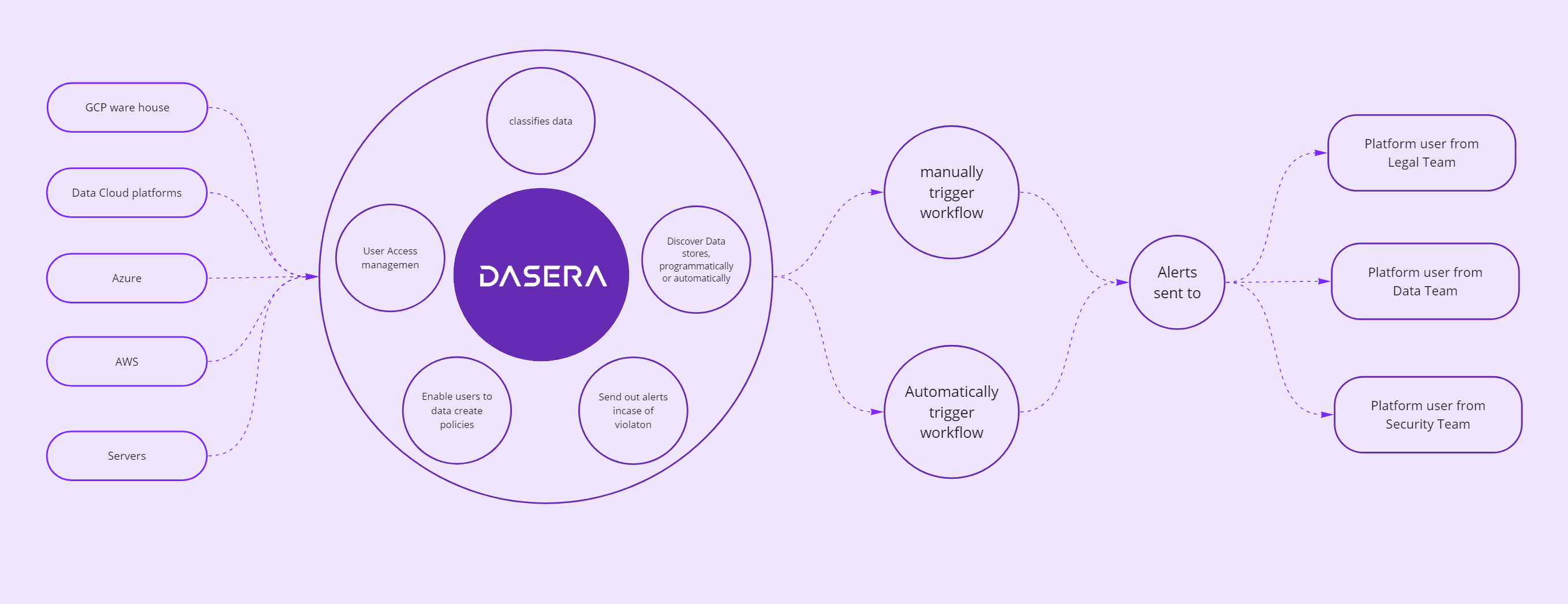
Dasera is a Data Security Posture Management (DSPM) platform that delivers automated security and governance controls for structured and unstructured data across cloud and on-prem environments.
In practical terms, Dasera not only grants customers visibility into their data and associated risks but also aids in ensuring compliance with GDPR laws.
Intial Scope
- Scale and maintain design library.
- Standardise UI components across the product and recommend alternatives where rquired.
- Conduct workshops with the client to understand their vision for the redesign.
- Propose how Dasera's navigation can be improved while considering mental models of different types of platform users.
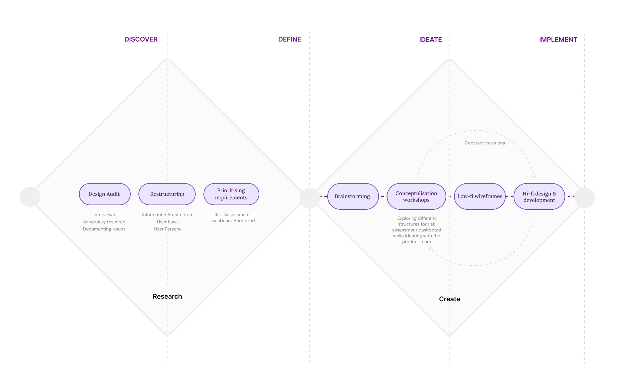
The Process
We followed the Double Diamond theory couple with lean UX process. We covered all the phases; Discovery, definition, Ideation and Implementation, and worked closely with Dasera's team throughout every stage.
Understanding users & their challenges
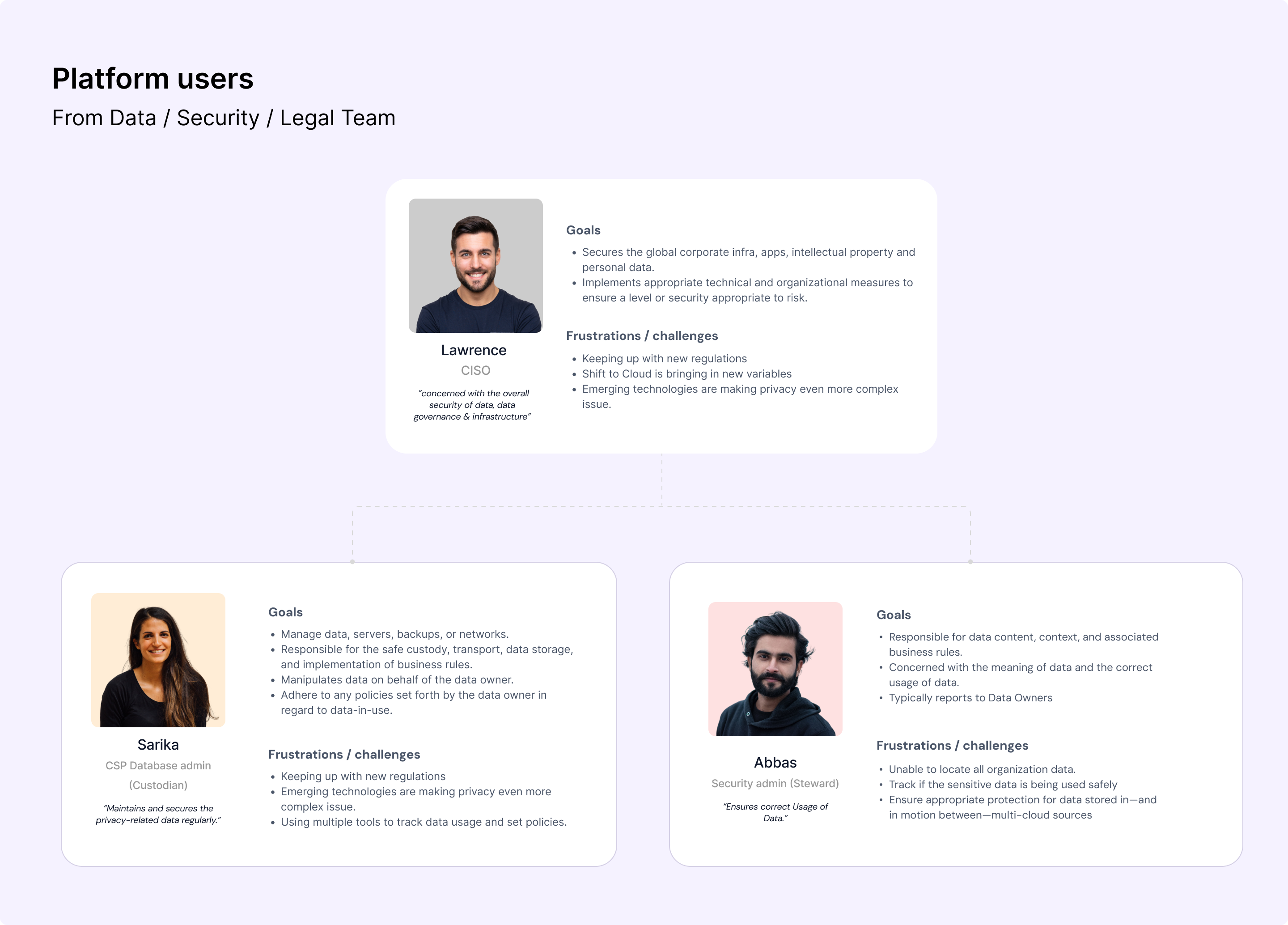
Product users were grouped together with customers (who are responsible purchase decisions) under the same umbrella. As a result this posed a challenge in addressing each of their unique needs. After gaining more domain knowledge, we categorized ussers into platform users and business users (customers).
For the re-design exercise, the primary emphasis was placed on Dasera's platform users who are generally from the Legal, Security, and Data teams and play important roles.
Diving deeper into the problem
After seggregating users in two groups we started the research phase. We started refined our research further by conducting interviews with different teams. Next, we conducted a design audit to test out features, funtionality, & the flow between various tasks. To get a realistic understanding, we tried to achieve two crucial goals on Dasera.
The first goal, was to configure Dasera for an organisation. It mainly covered the onboarding flow for a first time user.
The second goal, was to ensure that a group of users couldn't access a type of sensitive data.
While achieving these goals we encountered the following issues:
- For a first time user, product navigation was difficult to comprehend.
- The flow was breaking while achieving a goal. As a first time user, I often felt lost while completing a task.
- Was unable to quickly locate and view changes made on the product.
- Heavy usage of jargons. The product's tone of voice was more instructional than friendly or supportive.
- Unclear error messages; ineffective guidance on error resolution.
Prioritising Insights
After documenting several breakpoints and issues, we categorized them into Product, UI, and UX issues. Next we assigned each issue a level of criticality, marking them as highly critical, moderately critical, or less critical based on its severity. Additionally we also documented doubts we encountered while auditing these flows.
We then summarized these issues, considering their impact on overall UX and the effort required from design and engineering teams. This helped the product team to gauge which fixes could yield more value in a shorter amount of time.
#1 Information Re-structure: High Impact, High Effort
Re-thinking the logical grouping of information and features with a process lens.
#2 On-the-go Education: High Impact, Medium Effort
Standardizing the way users are informed or educated across the product about the inputs required for the system or how to make accurate decisions is a key focus. Start with: Risk Dashboard flow
#3 Policy Conditions Interface: High Impact, Low Effort
Redesigning this intuitively and friendly to get a higher success rate.
#4 Employee Directory Mapping Interface: High Impact, Low Effort
Can we make the mapping experience easier to understand and use, to get more accurate results.
Prioritising Risk Analysis Dashboard for restructuring
Our goal was to bring actionable insights upfront, adopt a friendlier tone of voice for the interface, and maintain simplicity in the main navigation.
Concept #1 The Bucket Approach
- Users see tasks and features under logical groups.
- The inbox reminds users to read and complete tasks.
- Infrastructure inbox: shows pending infrastructure actions.
- People inbox: reveals policy violations and actions to take.
- Policy inbox: notifies about creating rules to prevent policy violations.
Concept #2 The Inbox Approach
- Users can see upfront insights which guide them perform remedial actions.
- Clear communication upfront reduces decision-making time & flow friction.
- Users prioritize critical actions before less critical ones.
- Competitors often use a similar structure, educating users about tasks and their execution.

Concept #3 The Widget Approach
- Interface similar to competitor products.
- Enhances insights with actionable steps, which adds value to the information.
- Displaying a score upfront not only informs the user but also encourages them to improve the score.
Refining widget approach
The product team expressed concerns that a complete change in the product structure might be too drastic for users. Instead, they recommended implementing incremental changes to the widget approach and working on improving the logical grouping of widgets. Additionally, they suggested adding new widgets for CISO-level users.
This approach aims to acclimate users to smaller adjustments before introducing more substantial changes in the future.
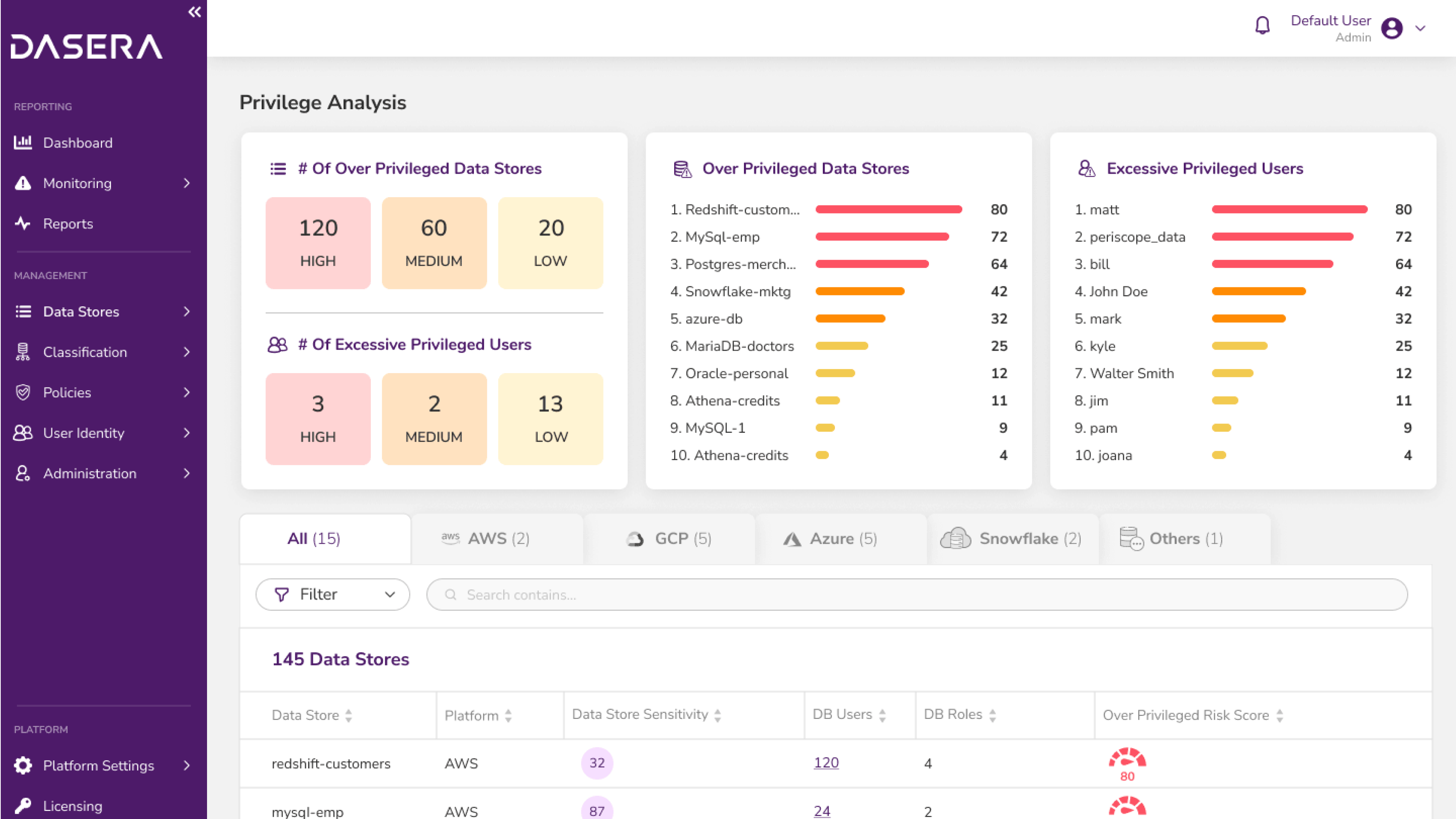
Final Design of Risk Assessment Dashboard
- Actionable insights are brought upfront for immediate attention.
- Supportive text is provided for all widgets to help users understand the meaning of each widget.
- Enhancing visual design of graphs.
Whats Next
Dasera's next steps involve refining the policy conditions flow and to test different dashboard structures with users by gathering valuable feedback for optimization. Additionally, focused usability testing will be conducted on the risk assessment dashboard to enhance its effectiveness and efficiency. These measures aim to ensure Dasera remains user-centric and continuously improves its features.
Ashlesha Hadkar
Product & UX Designer
ashleshamh@gmail.com →
© Ashlesha Hadkar, 2022